
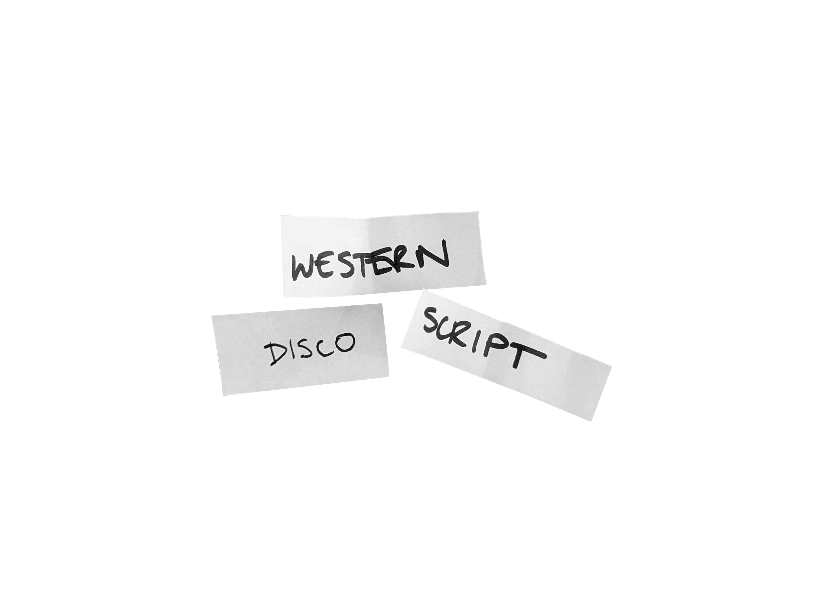
Another randomized hand-lettering challenge this week! This time, the random word generator gave me “disco.” So, that’s pretty fun.
The cups, though, gave me western for the theme and script for the typeface style. So looks like we’re going to have a disco cowboy situation on our hands.
First, I set out to research the typefaces of the Wild West. Everyone’s familiar with the Western style chunky slab serifs of the typical cowboy movie or frontier theme park, but I wanted to dig in a little deeper. This helped me not only fact check my preconceived notions, but also learn a little bit more about behind the history of typography in that day.
What I found was that this version of type was essentially an off-shoot, what some would call even blasphemous, of the fat face type that was popular in the 19th century. Fat faces were also originally dubbed Italian type. The thing about these though, is that they turned that style on its head. So, those thicks and thins are swapped in that the horizontals are now the thicks, while the verticals are thins. There are many more details on this type of… well, type, but I’ll just leave you with Wood Type Research’s piece about it, as it does a much better job explaining it than I ever could. I may be a designer, but I’m not quite an expert on typographic history’s finer details.
Let’s get into the process of this challenge!
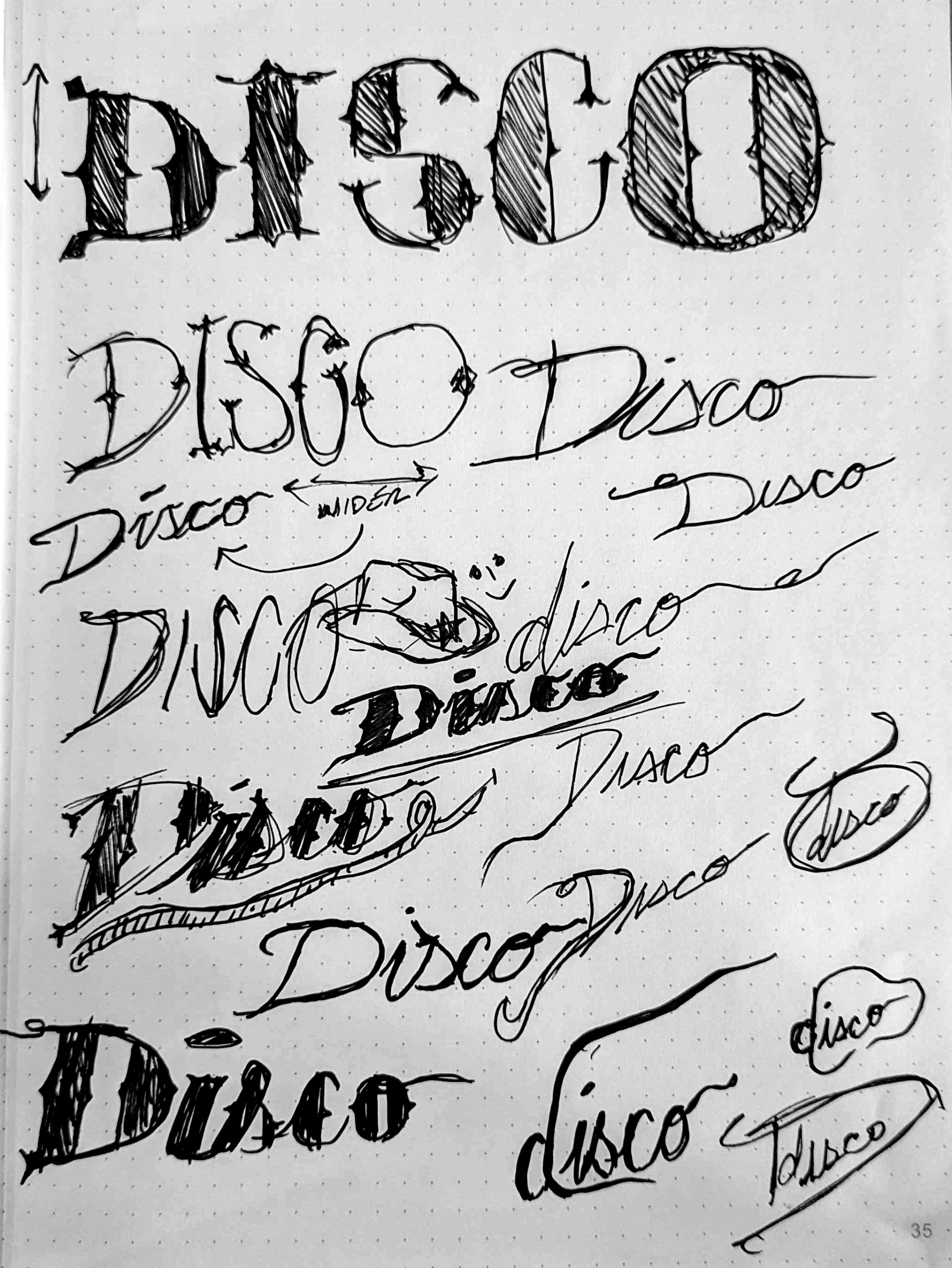
Not gonna lie, I struggled quite a bit with this one, and I think it was because of the script aspect. I can read and write cursive, but it’s not exactly pretty. So I was trying to compensate for that part, on top of adding in those chunky details of a fat face type. Here’s some of my sketches that I ended up coming up with.
Next, I jumped into Procreate for a wayyyy too long digital adaptation of what I thought was my best idea. Here was the initial first pass.

Then the next… and the next… I will say, I did enjoy the shape the stacked i and s made on this variation, but in the end it didn’t suit the latter half of the characters in the word, as well as not being as legible as I wanted for this exercise. There are times where artistic expression can overtake legibility depending on the intent or purpose, but for this, I just didn’t think it suited the result I was looking for.


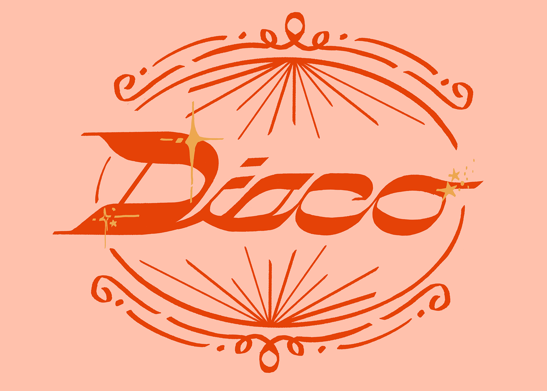
Finally, I adjusted the characters to this layout and started to be happy with it. I had initially planned to incorporate a rope into the word, as I had felt the type was reading too disco, or even Y2K a bit. Once I drew the rope, though, it turned out to be a little too… wormy.

ALAS! Once I got rid of the wormy rope and changed up the colors, it started to be the amount of western-y I needed. A perfect mix of cowboy and Abba, if you will. Cowbba? Anywho, I added some elements reminiscent of Nudie Suits from the ’50s, as well as bandana patterns. I tried to make them give off the same shapes and vibes as a disco ball for that extra tie together. I’m really happy with the result! If you’d like to see a timelapse, you can check out our socials!
*This post was written by a human named Alex.


